Helgz Studio Ceramics / helgz.com
Web Design, E-Commerce, Branding, Marketing Design
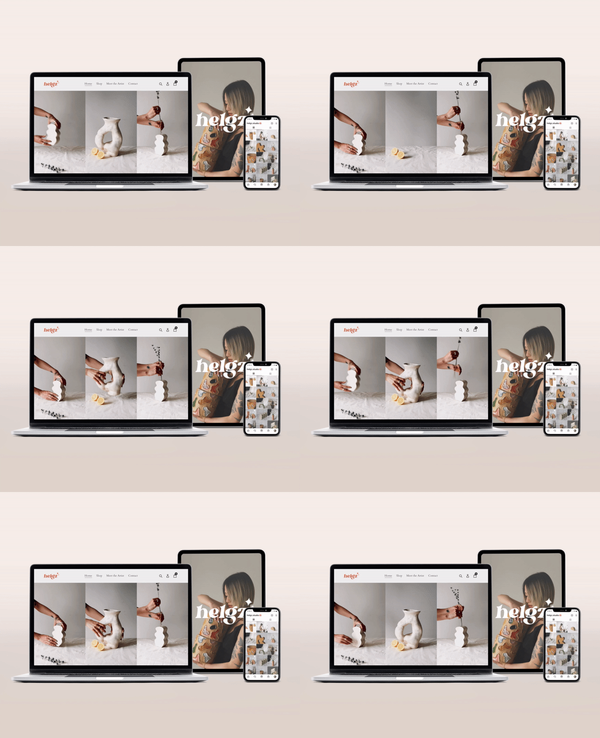
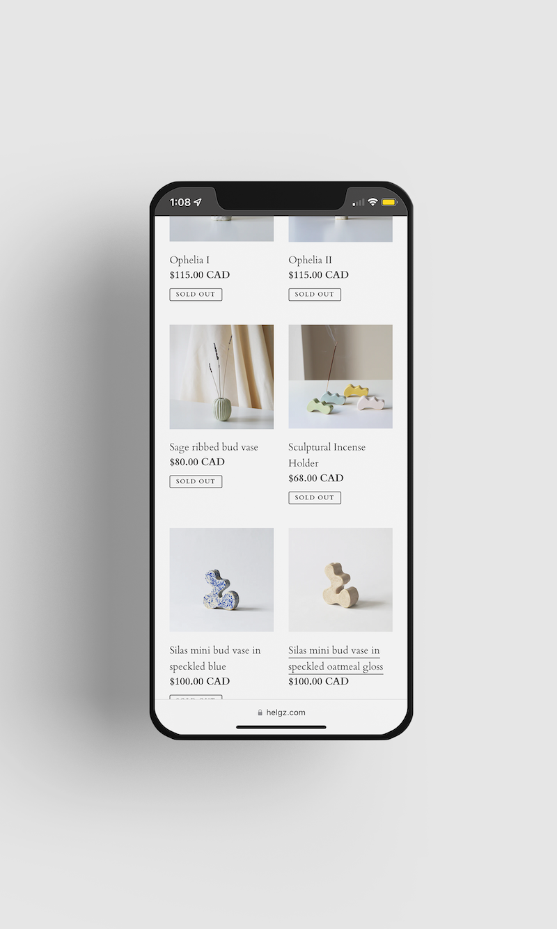
Table of contents
- Introduction
- Website Goals
- Target Audience and Brand Overview
- Competitive Research
- User Journey
- Proposal
- Design Details
- Conclusion
Introduction
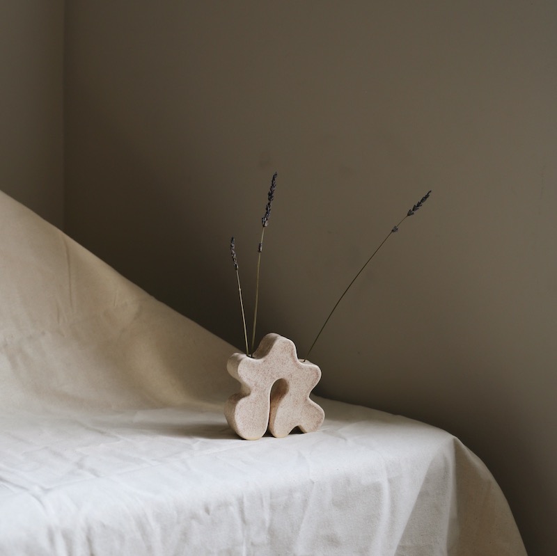
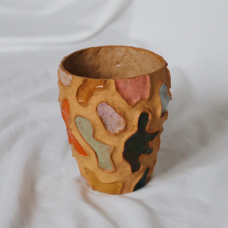
I launched Helgz Studio in 2021 as a passion-driven online business, exploring my creativity with a hands-on medium, while fostering my interests in entrepreneurship in a digital age. At Helgz Studio, I design and create contemporary ceramic pieces that aim to bring moments of stillness and joy into any home. The pieces range from mugs to vases to sculptures, and are each one-of-a-kind.
I handle all aspects of the studio, including ceramics production, design, photography, branding collateral, e-commerce, and marketing.
This case study will walk through how I approached the latest branding design of my e-commerce website, helgz.com.
Website Goals
The goals of the website are to increase brand awareness and drive purchases.
Target Audience and Brand Overview
This section covers context around the target audience and a brief overview of the brand values.
About the target audience:
- They are stylish home-dwellers who place care into the aesthetics in their home.
- They actively spend time and effort decorating and designing their living spaces.
- They are looking to elevate their home by introducing contemporary artistic elements.
- They value handmade, limited edition, one-of-a-kind items.
The Helgz Studio brand values are:
- Handmade: I operate with a small-batch cycle: I create a body of work and release it every few months. It’s important that the audience understands that each product is created using a slow, laborious process, and is one-of-a-kind. Helgz Studio not a big organization nor a factory, and it’s important that the audience is aware of this.
- Personable: Oftentimes, people can be easily intimidated by the elusive world of art-collecting. It can be an alienating industry for a consumer to enter. Being personable is at the heart of my business. I often share thoughts on my creative journey, intentions behind my pieces, behind-the-scenes snippets of the ceramics process, and aim to give my audience a peak behind the curtain.
- Well-Designed: My ceramic pieces are meant to last for many years. It should be of high quality, visually elevate a space, and bring joy to the consumer.
Competitive Research
Doing competitive research was helpful not only for guiding the design of the website, but also to understand the current market, gain learnings for business operations, and help define my brand at large. What kind of an artist am I? What does my work say about me (aka my brand)? Being mindful of these reactions as I researched other artists making similar work revealed contrasts with my own business values and how I would like the brand to be portrayed.
I surveyed brands within the online home goods space that fit the target audience. I particularly paid attention to branding styles, website structure, look and feel, and product offerings.
Below are a few of the websites I surveyed, ranging from sculptors to dinnerware-makers to lamp designers:
Some takeaways…
After surveying multiple brands, I noticed a few categories with distinct visual elements:
-
Luxury: Some websites seemed intimidating by having an elevated, luxury feel. Visual elements such as a monochrome colour palette (often greyscale), cinematic photography, and serif fonts create a timeless feel. These brands tend to target higher-paying audiences such as art collectors and luxury homeowners, with products in the high hundreds to thousands. Simone Bodmer-Turner’s work is a great example.
-
Trendy: Other brands were more “trendy” and approachable, utilizing bright colours and eccentric typography. These products are in the more affordable range, with most products under $100, and target a younger audience.
-
Commercial: Others were more “commercial”, like wooj.design. They sell products that are more industrially manufactured, but still include an artisan’s touch.
I wanted a visual language that sat between Luxury and Trendy, and avoiding Commercial, as it detracts from the handmade value of my products.
User Journey
Where are people coming from, and where are they going?
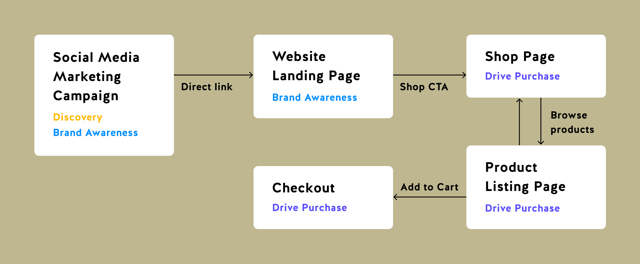
- I use Instagram as the primary form of communication, where I announce new work and post content for marketing campaigns. 92% of my sales are directed from Instagram. It’s where people find me, and where I market my work.
- Other avenues include word of mouth, referrals, and other visually-focused social media platforms such as Pinterest and TikTok.
Proposal
Since my site is hosted on Shopify, it was easy to handle checkout functionality (from finding the item, to adding to cart and purchasing it) by leveraging built-in Shopify tools. I thus focused my energy on the landing page of my site, site structure, and directing users to the Shop section.
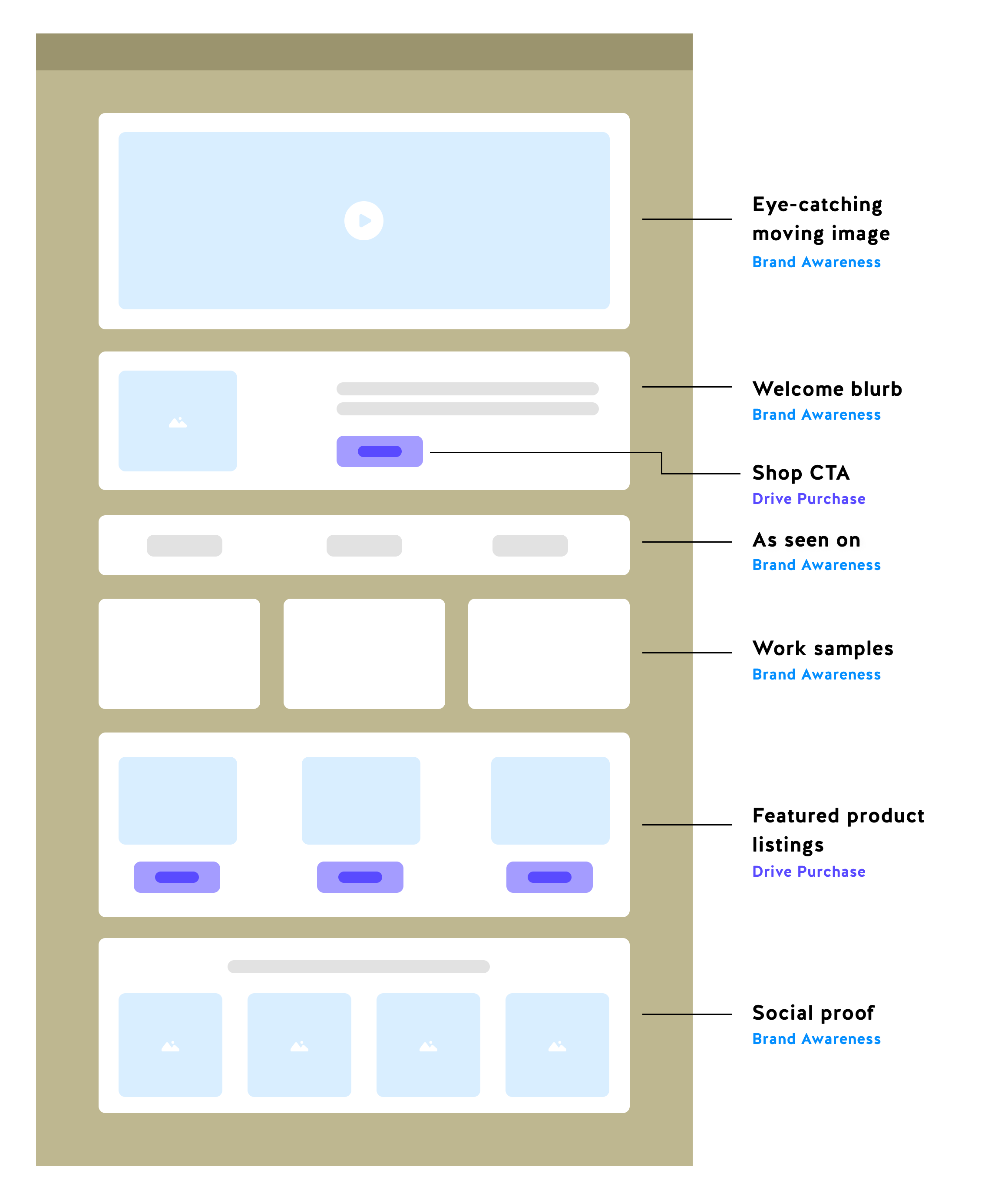
With this in mind, I constructed a simple narrative for the landing page:
- Start with an eye-catching visual to immediately to hook visitors in and show products in a compelling manner (brand awareness)
- Follow with a quick blurb that describes the work and the artist (brand awareness)
- Build trust with an “As seen on” section, showcasing magazines and brands that the sculptures have been featured or worked with. (brand awareness)
- Feature products, direct to shop (purchase)
- Social media feed (brand awareness)
The landing page should include ample entry points into Shop to drive purchases.
Other pages on the site are meant to host supplementary information for visitors who would like to dive deeper into learning about the brand. They include:
- Meet the Artist
- Contact
Design Details
You can experience the final design here: helgz.com.
Metrics and Testing
Coming soon!
Conclusion
My brand is always evolving as I gain more learnings in my business, and it is imperative that the design evolves with it. I am always making small tweaks to the website with every new campaign, as each body of work I create has its own unique style and message.